Dec 8, 2025
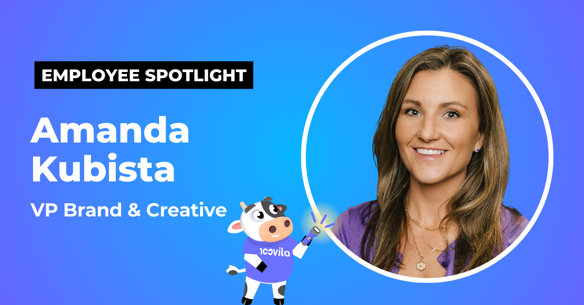
Spotlight on Amanda Kubista, the Creative Force Behind Mirabelle and Moovila’s Brand
Amanda Kubista, VP of Brand and Creative, brings Moovila’s voice and mascot to life with clarity, character, and heart.
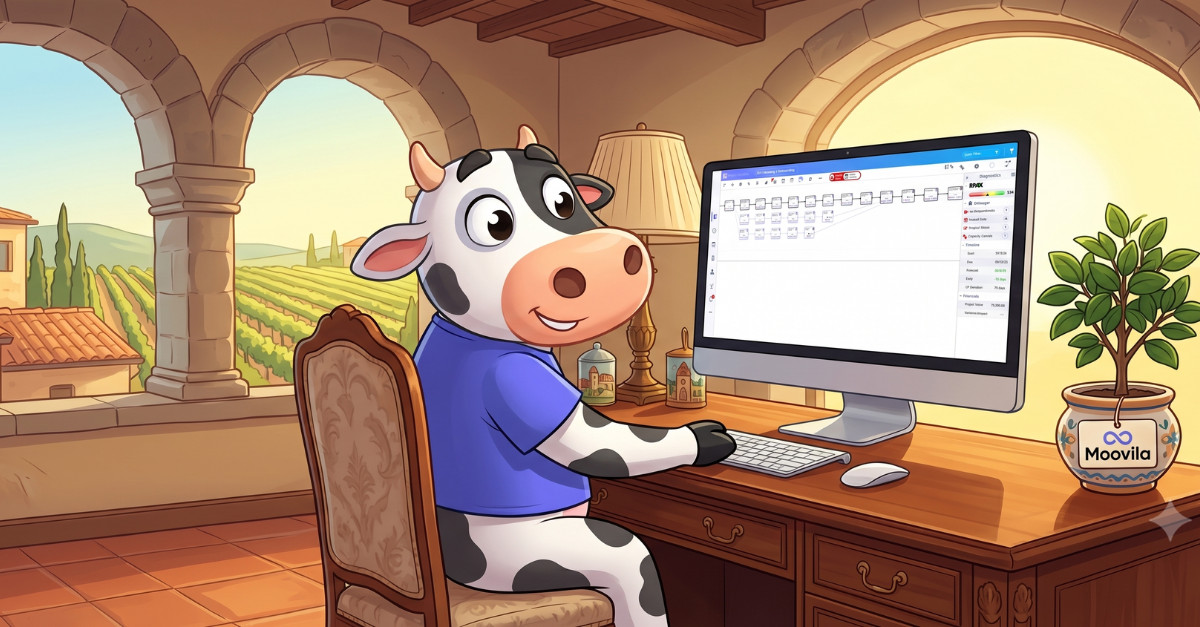
Amanda’s fingerprints are everywhere at Moovila, even if you don’t often see her on camera or out on the conference show floor. She brought our mascot to life, shapes our messaging, and keeps the brand relatable and consistent. Her design instincts define the visuals, tone, and personality across every channel. If you’ve watched an explainer video, scrolled our social feeds, or spotted our blurple booth on a show floor, you’ve already experienced her work. Mirabelle may be the face of the brand, but Amanda is the architect behind the entire world she lives in.
Amanda works behind the scenes and recently was named a Finalist for the CRN Women of the Year: Hidden Gem award for playing this unseen role.
We spoke to her about her work, how she arrived at Moovila, and what she does when she isn’t obsessing about cows.
Moovila’s cow is a recognizable part of the brand. What inspired that choice, and what does it represent to you?
Well, it’s right there in the name: “Moo-villa”. We've always known it was there, and we thought it might be fun to embrace it, but we weren’t sure if it was right for our audience. A lot of MSPs were asking us, though, why we weren’t doing something with the “Moo” in Moovila. So, we went for it... and are very glad we did!
I have a great freelance team that helps me create every cow pose imaginable. We have her lying on the beach, sipping cocktails, singing, and more. When we go to events in places like Nashville or Vegas, I'll ask for Mirabelle with dice, gambling, or playing a guitar. We use those images in our social posts. We love embracing the cow, now. I do try to keep the cow puns fresh, though.
People see Moovila as a bold, approachable brand. What are some of the guiding principles you use to keep that voice consistent and authentic?
Approachable is definitely an underlined word for me. It’s what I've always wanted Moovila to be. We are a tech company. We create software and have always had AI incorporated into what we do. But so much of that has become hard for people to understand. So, when we talk about Moovila on our website, in ads or blog posts, I want everything to be easy for people to read or see and quickly comprehend. I don’t want us to feel like an abstract tech brand that no one can grasp or relate to. That goes into everything, right down to the color.
I chose purple—though the shade has evolved over the years—because Moovila is a project management platform, a place where people track every moving piece of their work. I wanted the experience to feel calm and supportive, not like the system is yelling, “Everything’s late!” even when things are on fire. Purple evokes spas and lavender, not stress or chaos. And that’s the point: Moovila helps you manage the chaos without adding to it.
What first drew you to the creative field, and how did you find your path into brand development?
I have always, since I was a kid, been obsessed with color and design. My mom tells people that I wouldn't go to school if the pink bow didn't match the shade of pink of my dress and socks. Everything had to be perfectly coordinated. Years later, I had an internship at a local ad agency in high school where I worked with graphic designers for a summer. That’s when I knew this was what I wanted to do.
I went to college for graphic design and graduate school for art direction in advertising. Then I worked for ad agencies in New York, on brands like Mercedes, Marriott, and United Airlines. I’ve been with Moovila for many years, now. Since the beginning, in fact. But it was an interesting switch going from the agency to the client side.
That switch helped me understand both sides. At an agency, you make decisions based on your best creative vision, and then sometimes the work goes live and you think, “Why did they change that?” Now, on the client side, I see the strategy, the audience, and the brand evolution firsthand. I understand the “why” behind every decision. It’s my baby.
As VP of Brand & Creative, what’s your favorite part of bringing ideas to life at Moovila? Any project you’re especially proud of?
Being involved in the full process—not just the creative itself, but everything that happens before and after—is exciting and fulfilling. I love seeing what actually works, what doesn’t, and how we can evolve our ideas to connect better with our audiences. And because technology and ad platforms are constantly shifting, there’s always a new challenge to stay ahead of.
Bringing Mirabelle to life has been a highlight. She’s given us a stronger voice and a recognizable anchor for the brand, something everyone can connect with instantly.
I look forward to keeping Mirabelle going and evolving over time. At the moment, she's just cutting her teeth, so to speak. We have big plans for her. Helping her and watching her grow as we do will be very exciting for me.
Outside of work, what sparks your creativity or helps you recharge?
I love going to concerts. My best friend and I recently went to a yacht rock concert, looked at each other, and said, “This is my happy place.”
I got married this year and we bought a house, so life has been full in the best way. We are a blended dog family. My dog is a little nine-pound Pomeranian named Raven. She's tiny and black. I am from Maryland and am a huge fan of the Baltimore Ravens. I also love Edgar Allen Poe. So, her name was obvious to me. She bosses around our other dog Penelope, a sweet, 65-pound Lab/Pitt mix, but we think they've grown to like each other. I hope!
In keeping with my love of yacht rock, my husband, Paul, and I joined a boat club last year. Spending time near the water has always been one of my favorite ways to relax and recharge, which keeps me creative.
What advice would you give to someone trying to create a brand that resonates with people?
I love this question.
To start, it’s crucial to stay consistent in both your visual style and messaging so your brand is instantly recognizable at every touchpoint. That means aligning everything from fonts, colors, and photography style to tone of voice and core value propositions. For example, we use a distinct purple-to-blue gradient (and now, Mirabelle) as visual brand cues. So, when someone sees an ad, visits our website, or stops by our booth, they connect the blurple dots to Moovila.
I also think it is so important to remember that we are all people, so even as a brand, we should talk to people like people. There's often a resistance to that: “We have to have a high-level perspective and use big words!”
But, as a brand, you connect with your audience more when they feel that you understand them and are talking to them. I think being authentic, genuine, and having a real voice and a point of view that is down to earth is essential. If customers feel that you are being helpful and educational, not just pushing products at them, or trying to shout buzz words, they will trust you more. That’s the kind of connection we’ve been intentional about building.
To learn more about Moovila and our team, check out our blog. To get more Mirabelle in your life, follow us on Instagram or LinkedIn.
MooCrew Spotlights